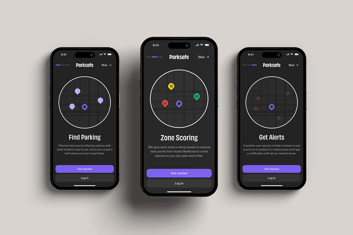
Parksafe
Year
Category
Client
Role
2023
UX/UI Design, Branding
Personal Project
UX/UI & Brand Designer
Parksafe is an app designed to take the guess work out of parking so the user can focus on what matters most, the destination. This project originated as an idea I had after being sick of trying to find parking and getting tickets.
The Prologue
Parksafe is an idea I had from working and parking in the city. The current system doesn't offer great solutions for people who spend several hours downtown. In the downtown core, meters have max time limits of 2 hours and the highest hourly rate. Forcing people to move their car every 2 hrs, park further away, or risk it and potentially get a ticket. There are parking lots, but most are more expensive than street parking. There are street parking passes, but those are for downtown residents and can only be used in all-day zones, so they aren’t really a solution either. Additionally, none of these solutions solve the added issue of security for your car.
The Process
Empathize:
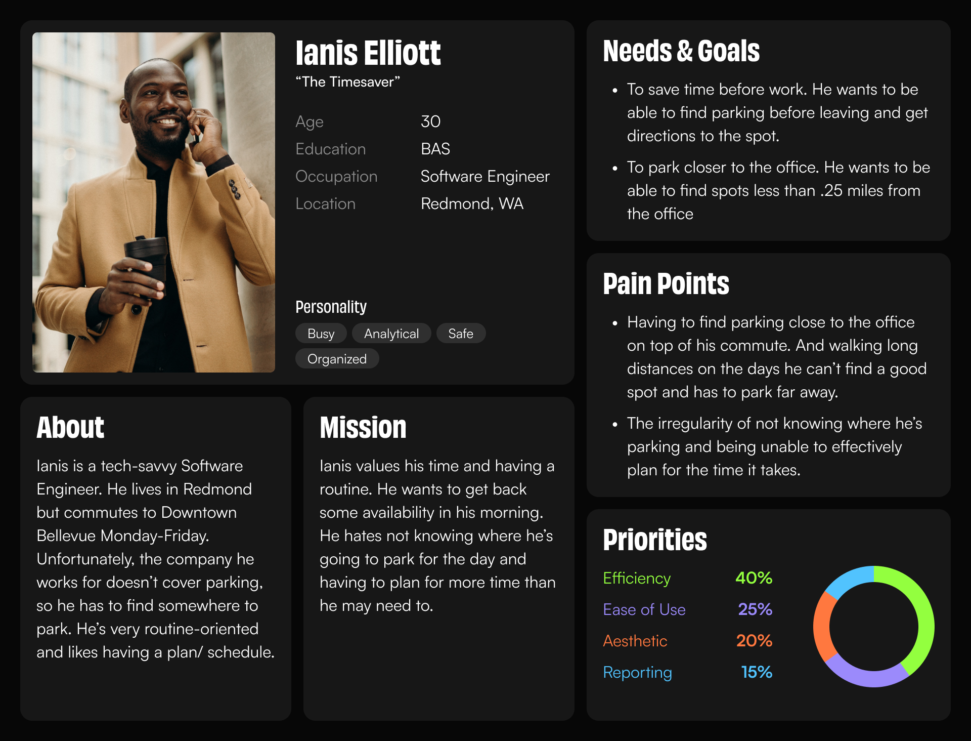
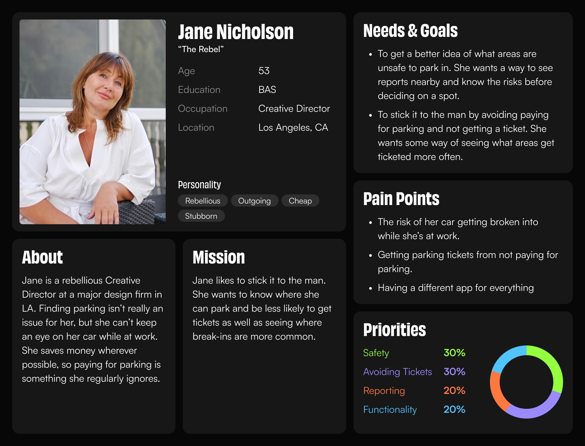
Since this app came from personal motivation the original empathetic understanding was easy to determine and pulled from my own pain points. I knew what I wanted out of the app, but I also wanted more points of view. So I interviewed other potential stakeholders and noted frustrations as well as imagining the city I live in as a stakeholder, which allowed me to think of potential integrations with the current system.
Define:
The current parking system is not considerate to all users, especially those working in the downtown area, and needs more accessibility. There are private lots with day or month passes which solve the issue of finding parking and tickets but don’t solve the security issue or cost since they are usually the most expensive option.
Ideate:
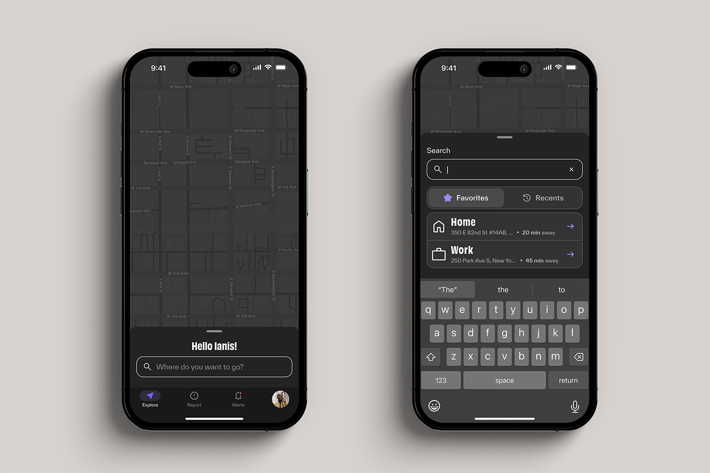
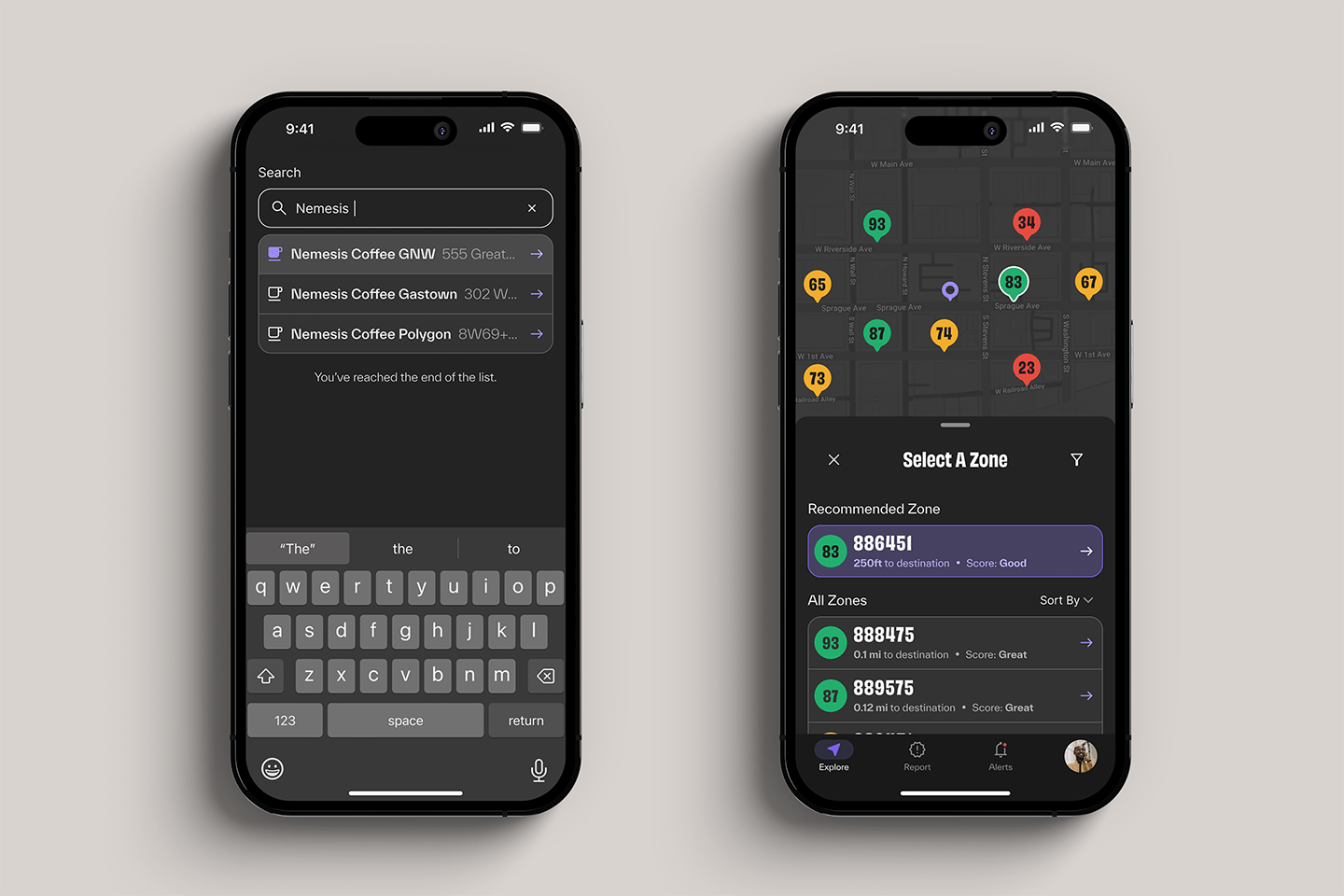
Before getting into the design I wanted to plan out how some of the functionality would work. To solve the issue of finding a spot I wanted to allow users to search for their destination and see the zones nearby. To solve the parking ticket issue and unsafe parking areas I wanted to incorporate a rating system for each zone.
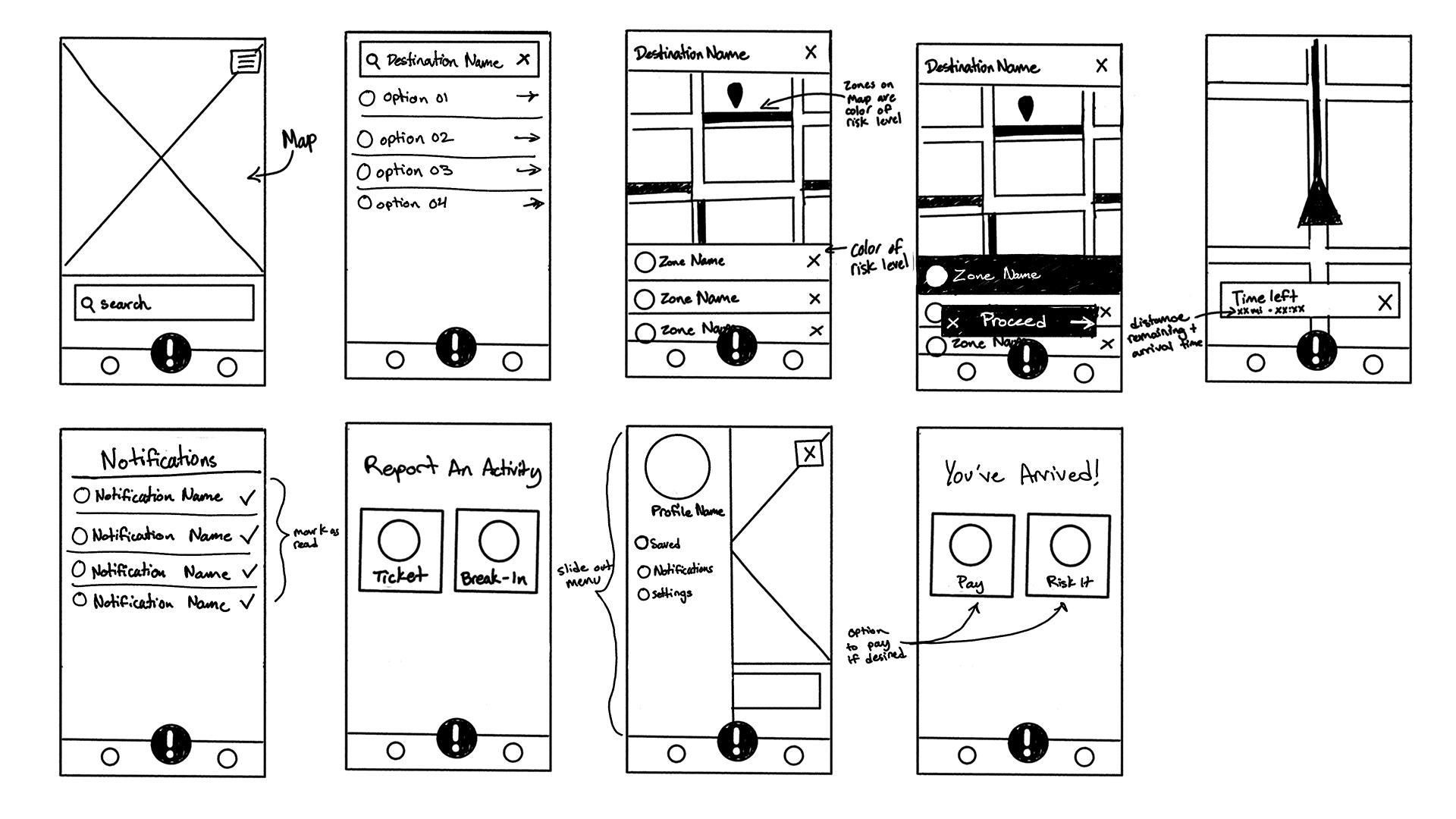
Prototype:
I decided Parksafe would exclusively be a mobile app. This made the most sense since people will most likely be moving around while using the app. Which cut out designing for different screen sizes and allowed me to focus more on the functions of the app. This step is also where a lot of the issues I would then later realize in the testing phase began to surface.
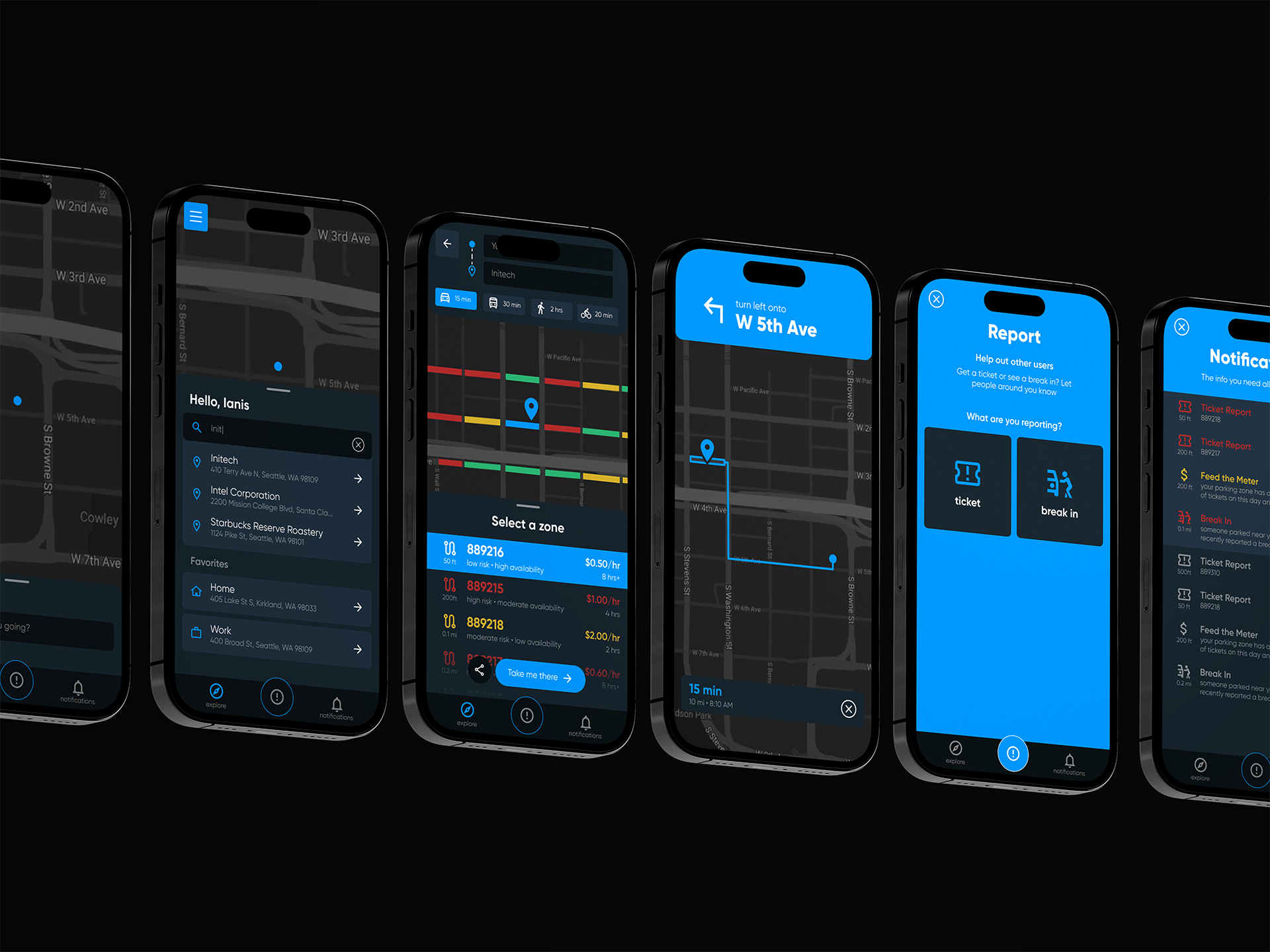
Version 1: My first attempt back when I first started learning UX.
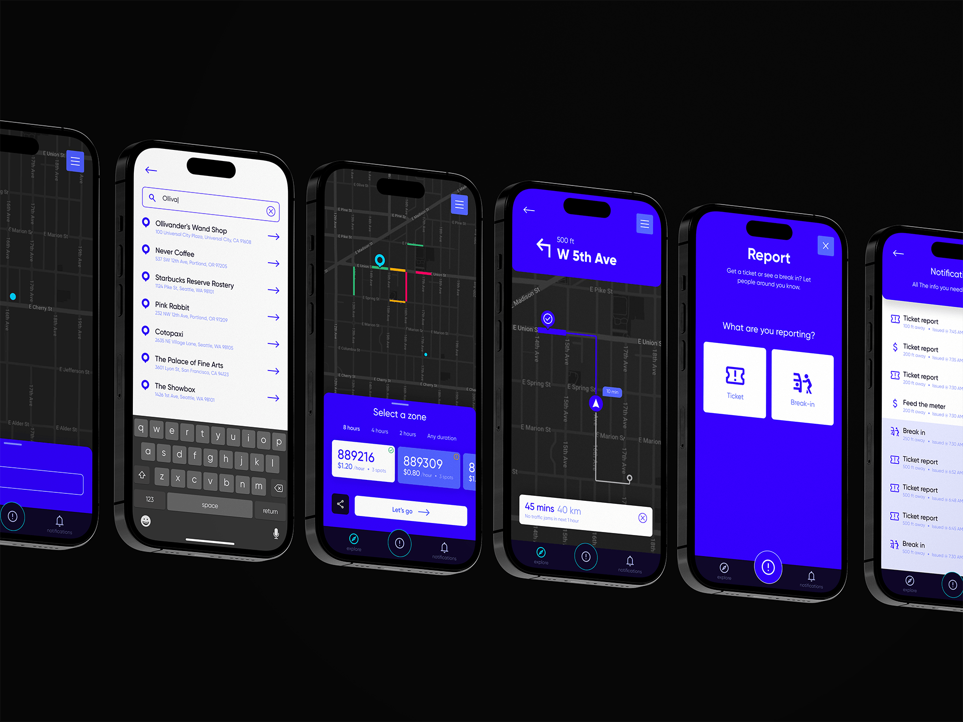
Version 2: After growing my skills I decided to revisit this project.
Test:
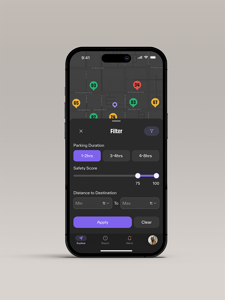
In testing, I discovered some unnecessary functionalities that added too much complexity and muddied the true function of what the app was supposed to be. The main changes that resulted from testing after V2 were restructuring the information shown on the zone selection and expanding on the filtering beyond zone time limits. This helped cater the results more effectively to the individual users' wants and needs.
The Reflection
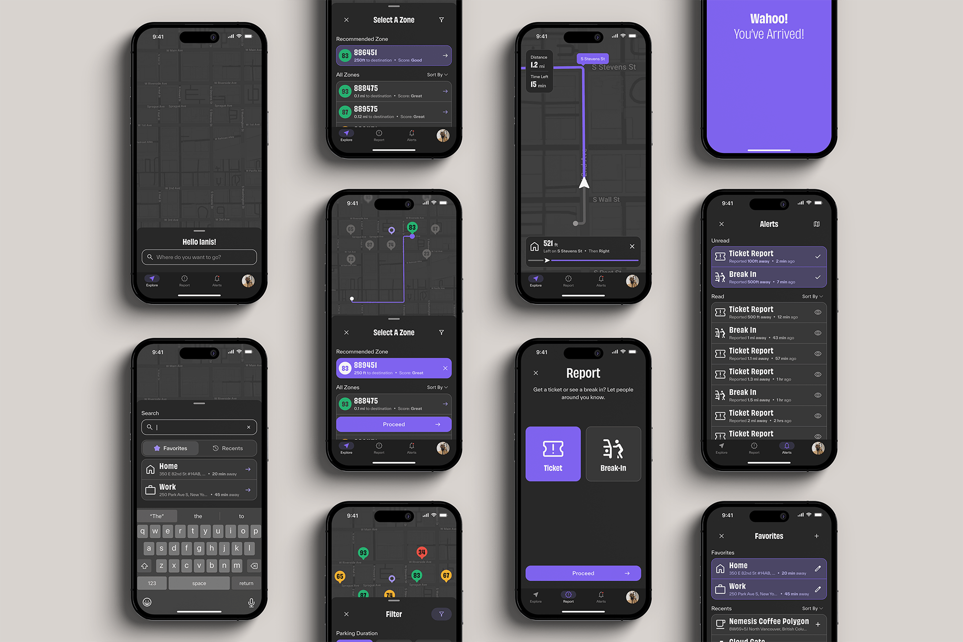
Initially, I created a lot of functions that depended on systems I hadn’t considered initially, like the rating system for parking zones. How would this safety score be determined? My first solution was the app could integrate with the city’s current parking system to pull ticket information and crime data for break-ins. Since this was something I couldn’t rely on I decided on a system that allows users to report tickets and break-ins. Ultimately this led to adding notifications so if someone did get a ticket or broken into the report would go out to other users parked in the area so they could avoid the issue or ignore it. I also gave too much weight to thinking of integrations with the current parking system like adding a parking payment system that entirely depended on integrating with the city. The first design put too much emphasis on the report function which originally I wanted to call more attention to, but ultimately it’s a secondary function and the primary is finding the best parking spot.
Select Design Improvements
Accessibility
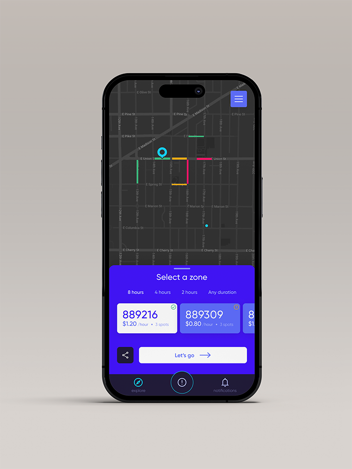
With each design, I updated the color themes as part of semi-rebrands. Both V1 and V2 of the app were accessible in some areas and missed the mark in other areas. The new system is a complete overhaul of the system and ensures readability and accessibility throughout.
Before (V2)
Both previous versions used the brand's primary color too heavily. This took focus away from functions or made them unreadable.
After (V3)
With V3 I implemented the tailwind color system to provide depth and the primary color is now used to highlight functions or signify action.
User Friendliness
With V1, I was overly ambitious and tried combining too many things, leading to functions like directions for different modes of transportation even though the only one that matters is by car because the purpose of the app is to find parking and none of the other modes matter.
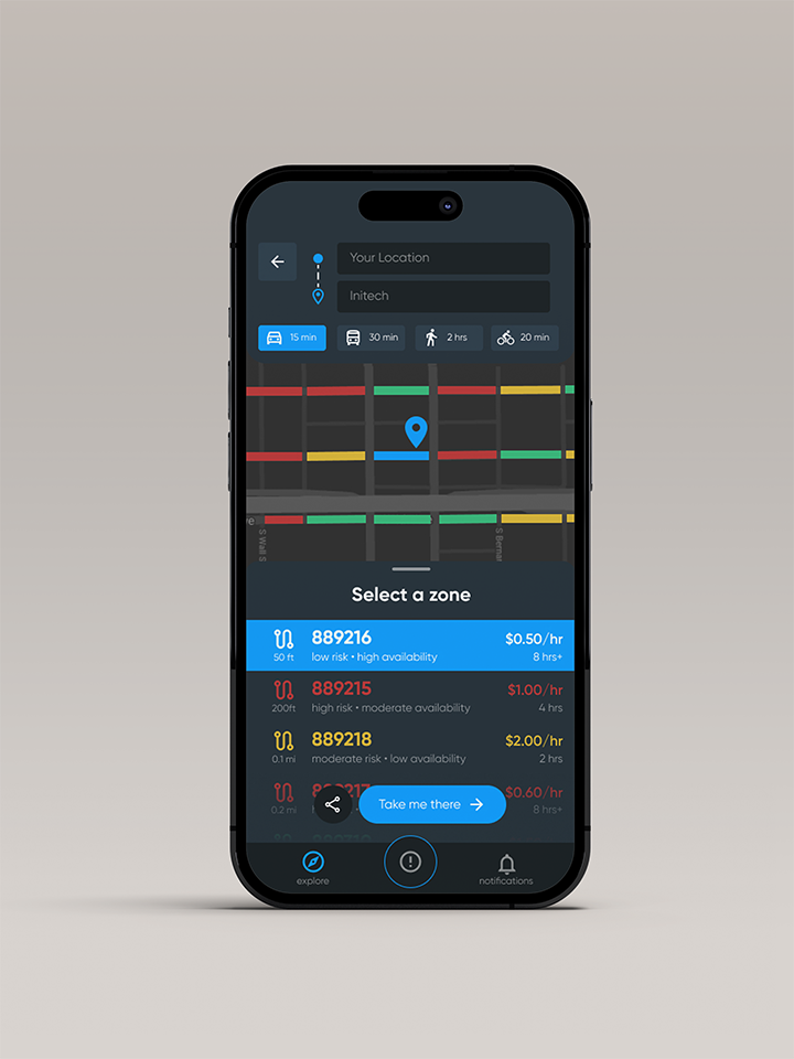
Before (V1)
V1 had some functions that I thought made the product more inclusive at the time but after reflection realized most served no real purpose or took away from the real goal.
After (V3)
In V3 I cut all the unnecessary and added functions that actually make the goal of the app easier for the user like filters and sorting.
Before (V1)
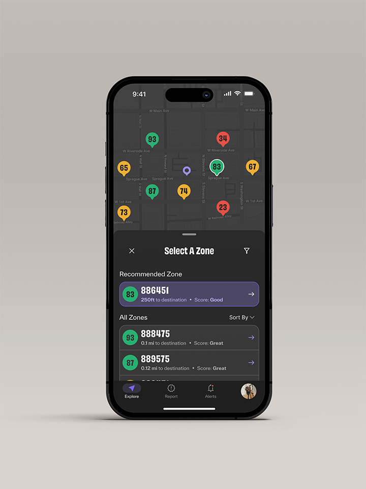
The previous versions of zone selection provided the necessary information but, in a way that wasn't easy to connect what is on the map vs the list.
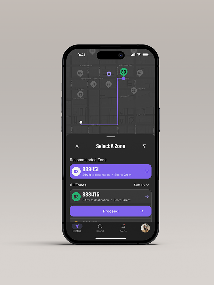
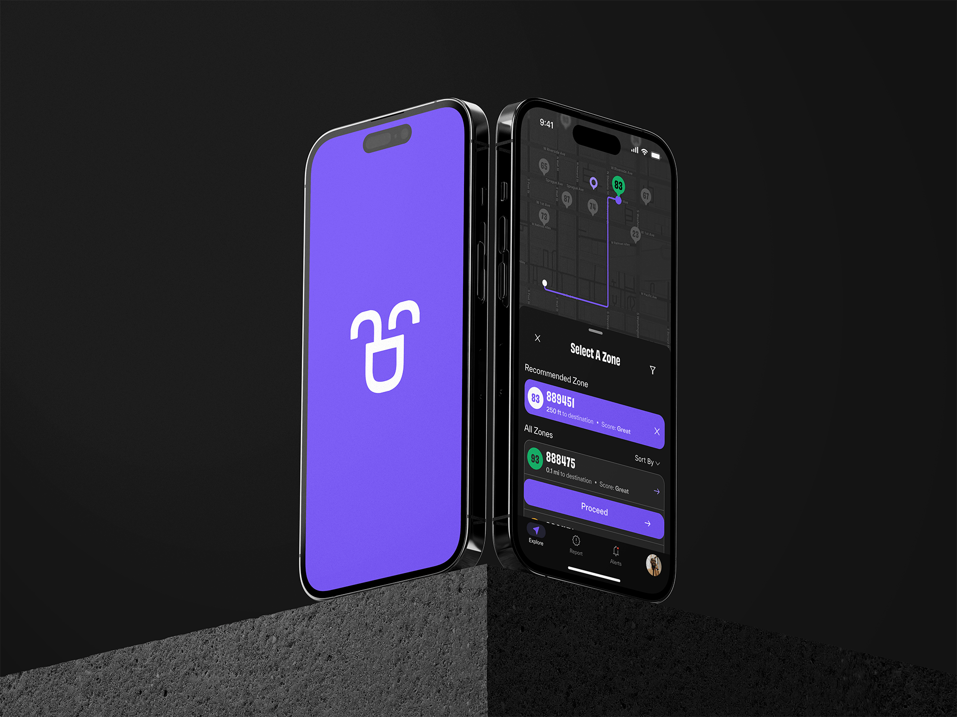
After (V3)
To make this step easier a recommended zone was added and the map view also has the zone scores listed along with the color coding.
The Summary
Parksafe has gone through three iterations, each stemming from revisiting the project after growing my skills and reflecting on the design. Originally, the scope was too broad and didn’t have a clear purpose. The second was intended as a design refresh but didn’t fix the core issues with the first and created some others. The core has always stayed the same but some of the solutions have changed. Pieces that didn’t make sense got cut, and features that were underdeveloped gained thoughtful solutions. Now the project truly focuses on its goal: finding the best parking spot for the user.